Widget customization
Make feedback feel at home in your app. Choose a launcher, match your surface and decide how your users encounter capture choices.
Choose your launcher
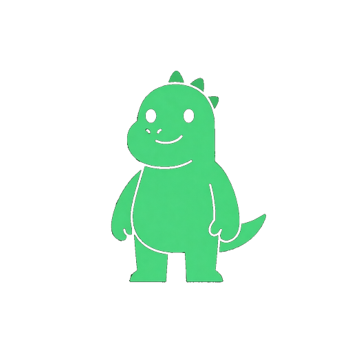 Testo
TestoThe familiar dinosaur, with its signature peek.
A compact feedback icon that stays out of the way.
An icon and visible label for a clearer invitation.
All three styles are available on Free. Testo is the default. Its body peeks above the stationary hands on hover and keyboard focus; reduced-motion preferences are respected. Choose the bottom-left or bottom-right position to fit your application.
Appearance
Choose a light or dark panel surface on every plan. Pro and Enterprise also support a custom accent color and removing the Testosaurus branding. The accent is used across controls and selected states; check both surface and accent together in the preview.
Content
On Pro and Enterprise, edit the panel title, welcome message, message placeholder, send-button label and feedback tags. Use labels that help your users describe what happened. Free projects use the default wording and tags.
Capture choices
Every plan can choose among three consent presentations. These change how the choices appear; opening the widget never grants permission to capture a screenshot or replay.
- Wizard — a guided choice before composing the first report, including a message-only path.
- Inline checkboxes — screenshot and replay choices beside the message.
- Separate prompts — individual capture choices alongside the feedback flow.
Browser context and the user's message remain distinct from optional attachments. Replay inputs are masked by default. See Privacy & consent for the capture rules and active-testing mode.
Preview before saving
Switch between desktop and mobile sizes, then inspect Welcome, Consent, Compose and Success. The isolated preview does not capture your screen, record a replay, send feedback or change your consent choices.
Changes stay in a draft until saved. Paid controls remain available to preview on Free and are clearly marked; previewing a paid value does not publish it. Save the basic settings that your plan supports, upgrade for paid customization, or discard the draft.
Open from your own button
After the SDK has initialized, call open() to open the normal widget flow from a button inside your application:
import { init, open } from 'testosaurus-sdk';

await init({
  endpoint: 'https://testosaurus.dev',
  apiKey: 'pk_YOUR_PROJECT_KEY'
});

document.querySelector('[data-feedback]').addEventListener('click', open);
For the script-tag bundle, use Testosaurus.open(). It returns true when the mounted widget receives the request and false when no widget is mounted. Consent still applies. See the API reference.
What is included
| Setting | Free | Pro / Enterprise |
|---|---|---|
| Testo, Bubble or Feedback pill | Included | Included |
| Position, light/dark surface, consent style | Included | Included |
| Custom accent, wording and tags | Preview only | Included |
| Remove branding | Not included | Included |